Kirk House
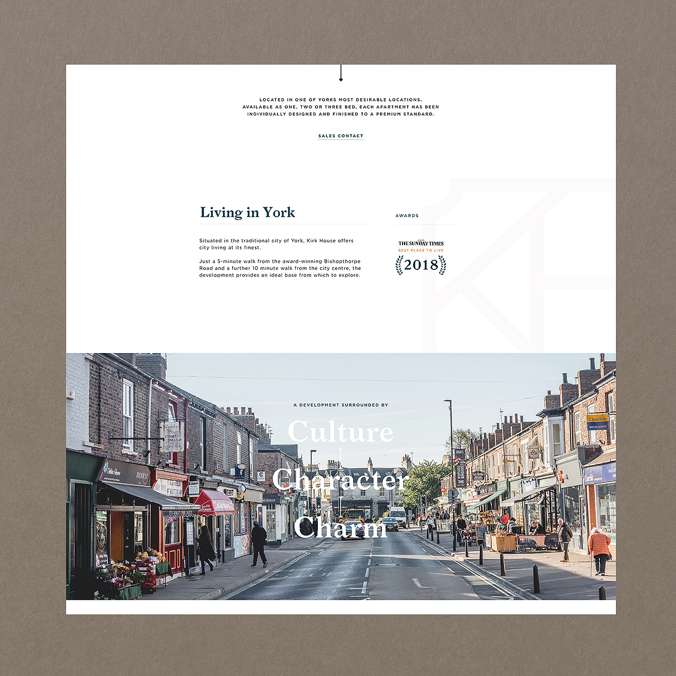
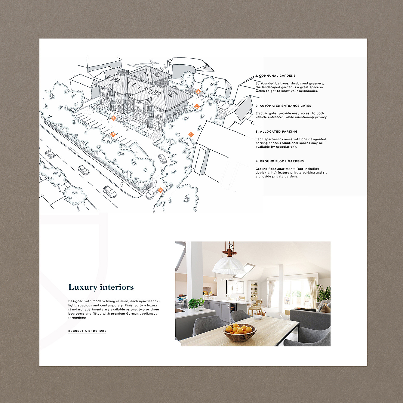
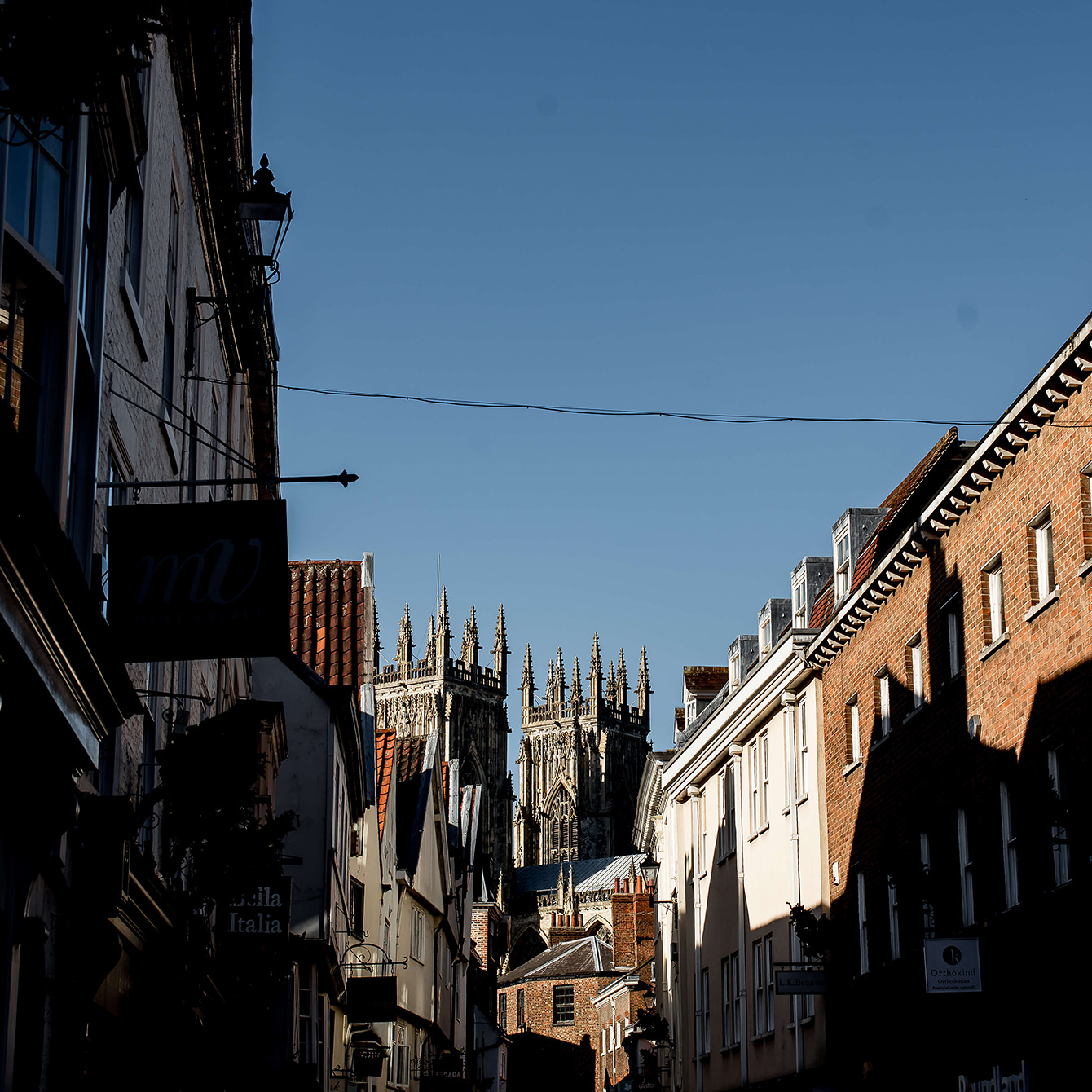
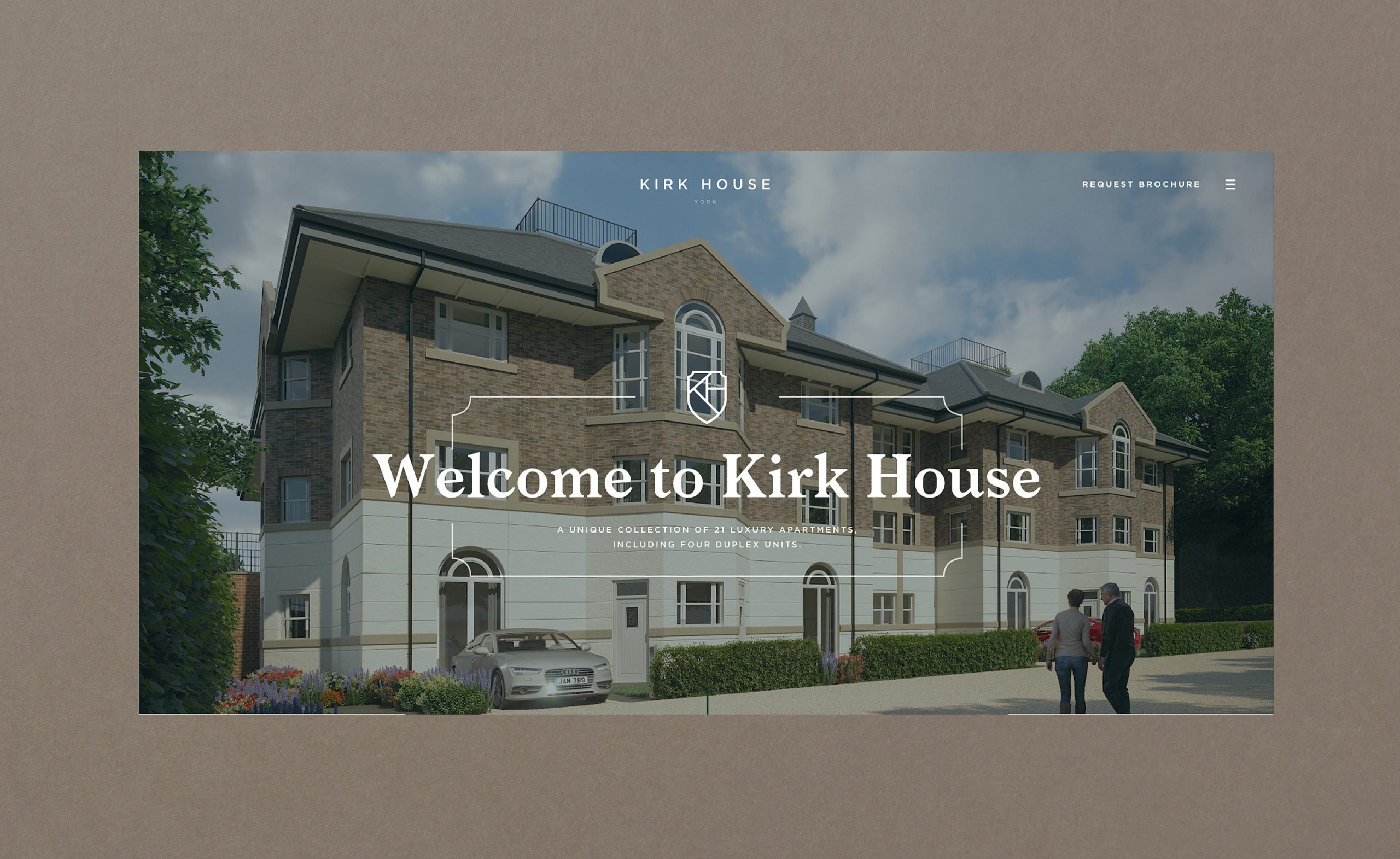
Kirk House is a unique development of 21 luxury apartments, situated just outside York’s iconic city walls. Each apartment has been individually designed with elegance, taste and wellbeing firmly in mind. Lovely grounds and generous parking complete the package.
Kirk House wanted a strong, distinctive brand identity to allow it to command attention and stand out from other new property developments around the city.
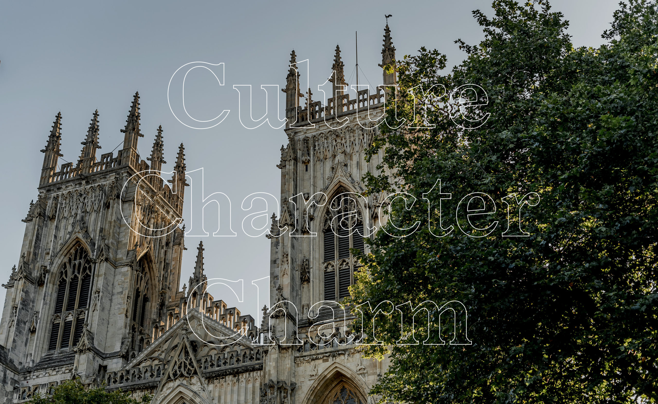
The visual language needed to effectively communicate the development’s two key benefits – location and luxury.
Read moreOur Approach
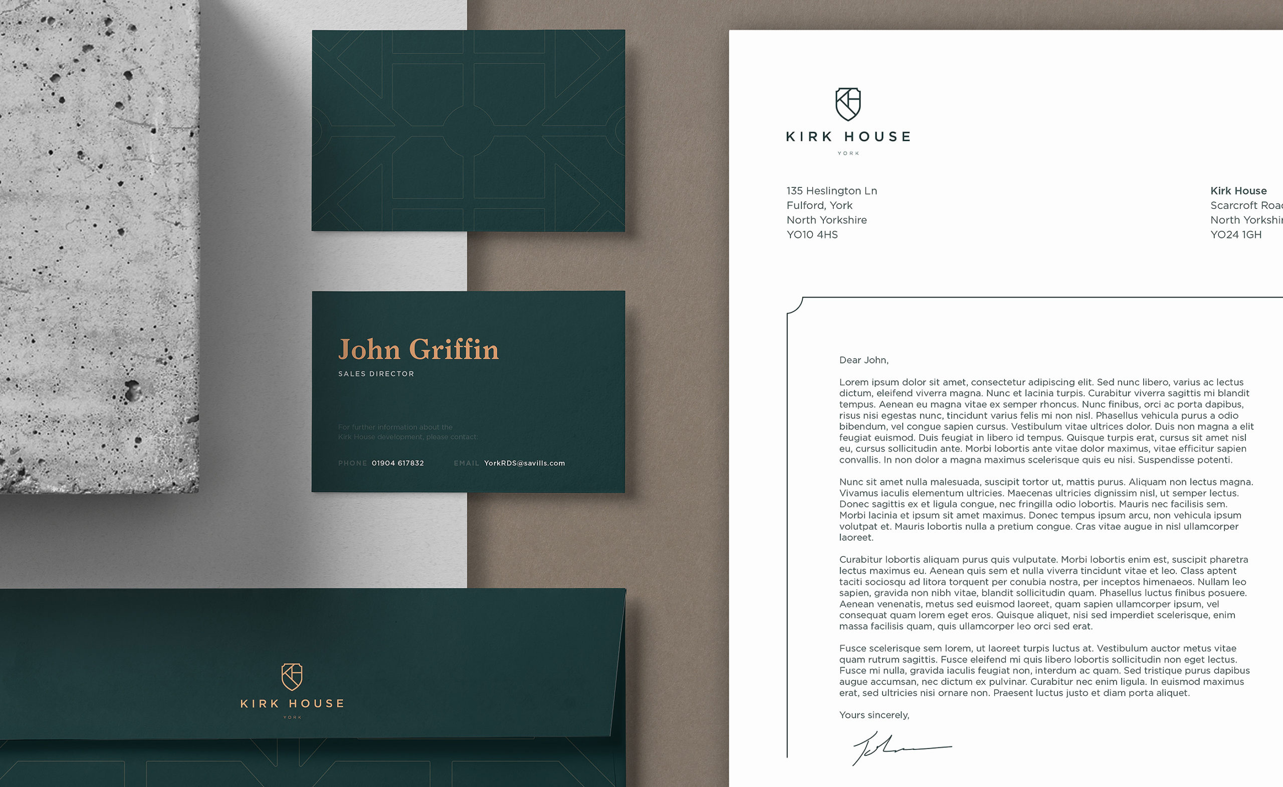
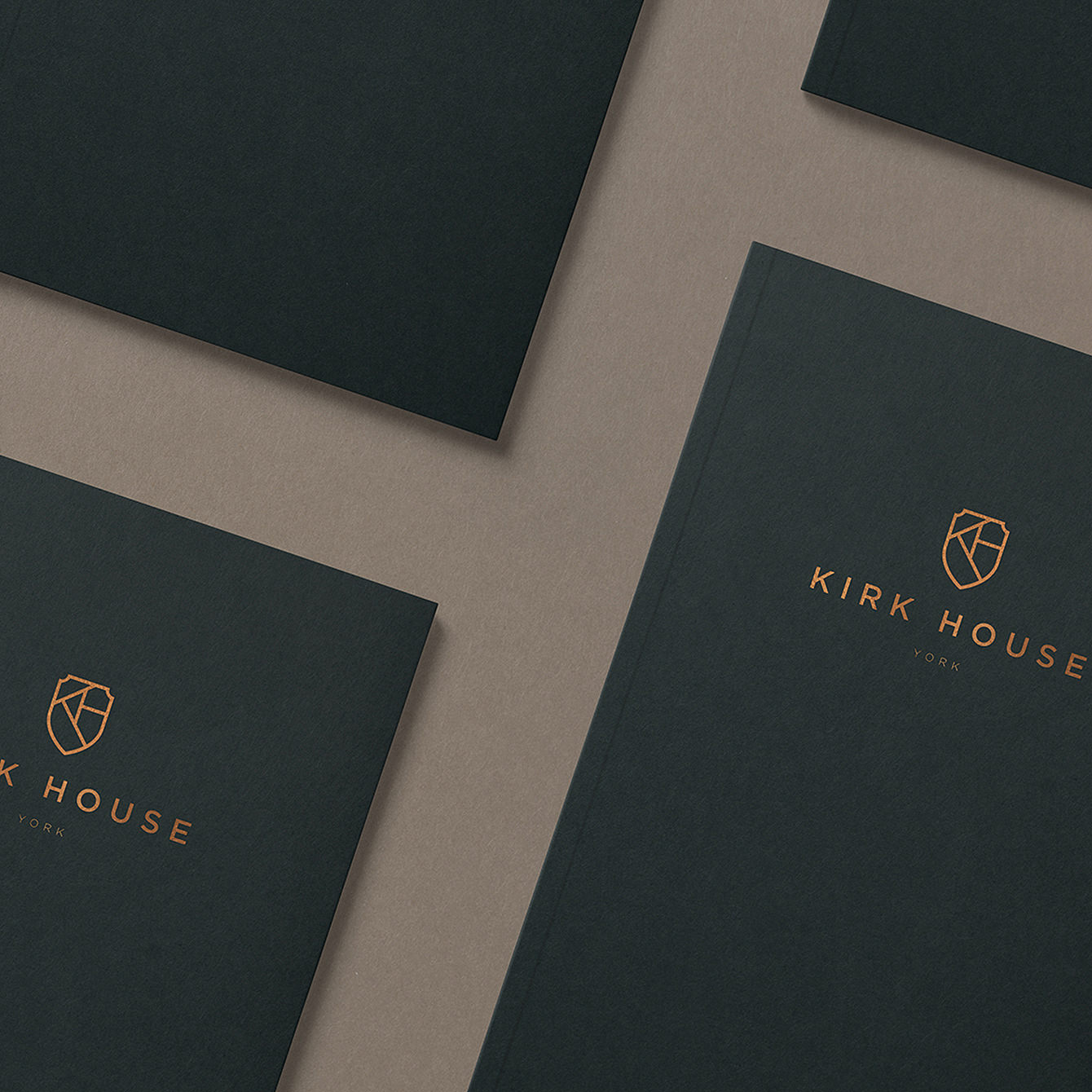
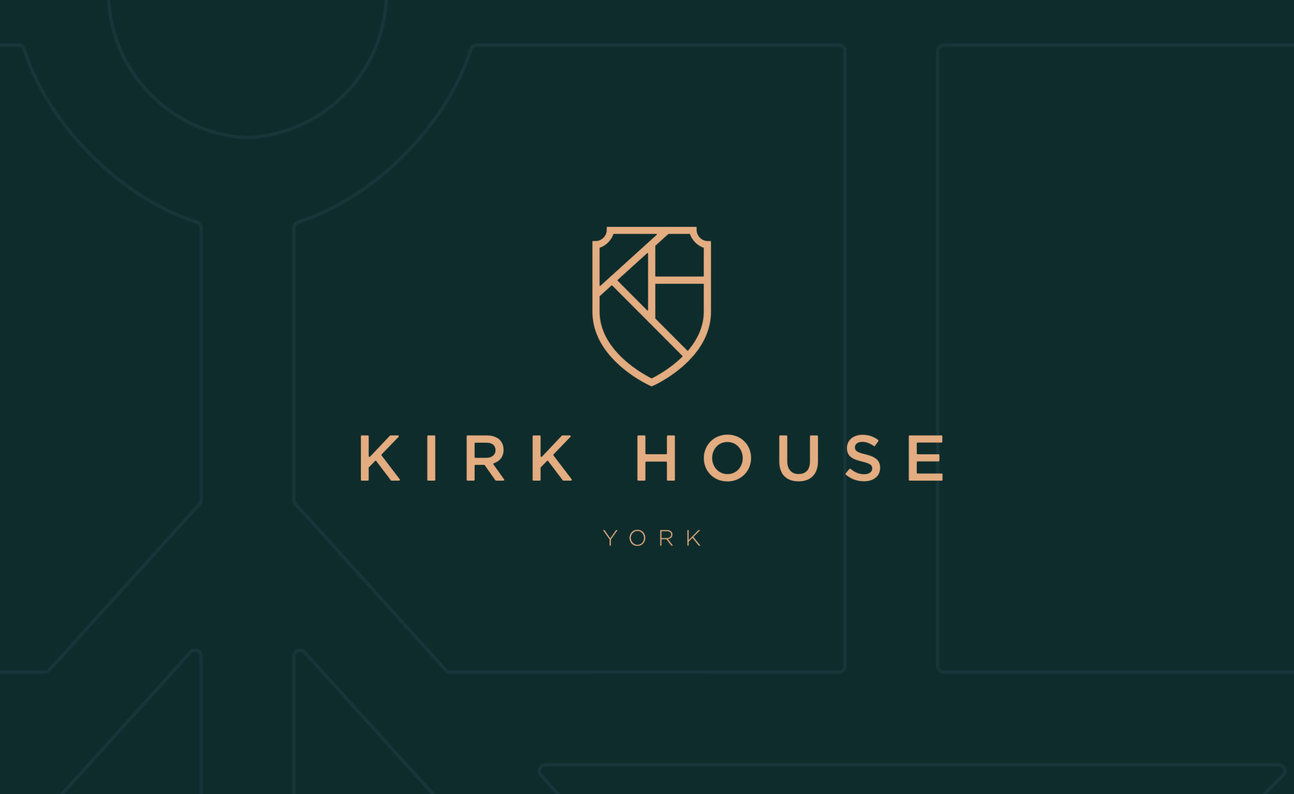
We created a beautiful but simple heraldic crest for the brand’s logo. While its form says heritage, its simplicity says modernity. This neatly echoes the development’s historic location and contemporary finish.
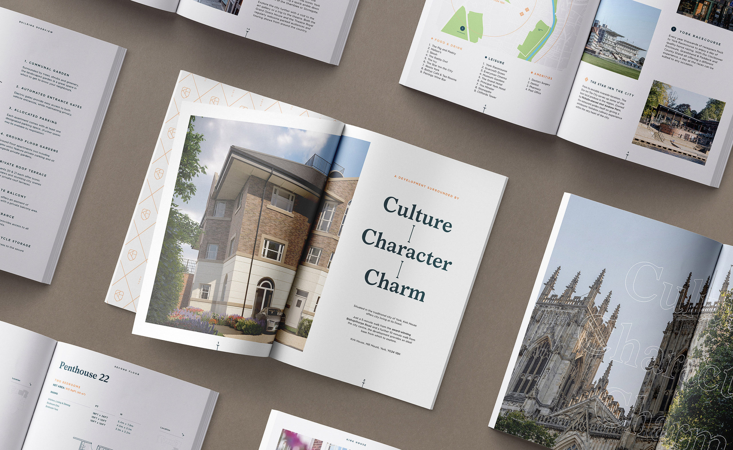
We then developed a typeface and colour palette that would work across the marketing mix. Terracotta and forest green were chosen to emphasis the quality of the build and its leafy setting.
Once all the visuals assets had been defined, the new brand identity was rolled out across digital and print.
Services
Brand Identity, Print Design, Way finding (Signage), Website Design & Development
Sector
Real Estate
‘The development is a special landmark in a fine city. The identity and promotional communication that supports it sets exactly the right tone to market the properties on a national scale’
Jonathan Laverack, Kirk House